Problem Statement
Students need a convenient & easy way to consistently manage their mental and physical health, access resources, and connect with a professional because the stresses of being a college student are overwhelming & can become unbearable to a point of breakdown.
04. Finding inspiration on how to create a clear onboarding experience, free features, & exude calmness
Competitive Analysis
We conducted an in-depth competitive analysis within the wellness and mobile therapy industry, examining industry leaders such as Better Help, Talkspace, Melissa Wood Health, and Form. Our objective was to identify their distinctive features and understand their primary objectives, serving as a source of inspiration to inform our project's direction.
BetterHelp:
- Onboarding process includes extensive questionnaire to match users to the right therapist
Talkspace:
- Therapy options laid out in clear, organized format
- Calm and "young" feeling exuded
Melissa Wood Health:
- Scannable homepage with categories based on user preferences
Form:
- Locked free-content without account
-Navigation bar with explore page

05. How can we solve the probelm?
Early Sketches
In the solution ideation phase, we used the insights from our user research as a foundation. We initiated the process with sketching, a quick and cost-effective method that facilitated brainstorming and feature prioritization. This approach allowed us to identify the most valuable features for wellness seakers, including Overextended Olivia, before diving into wireframing.

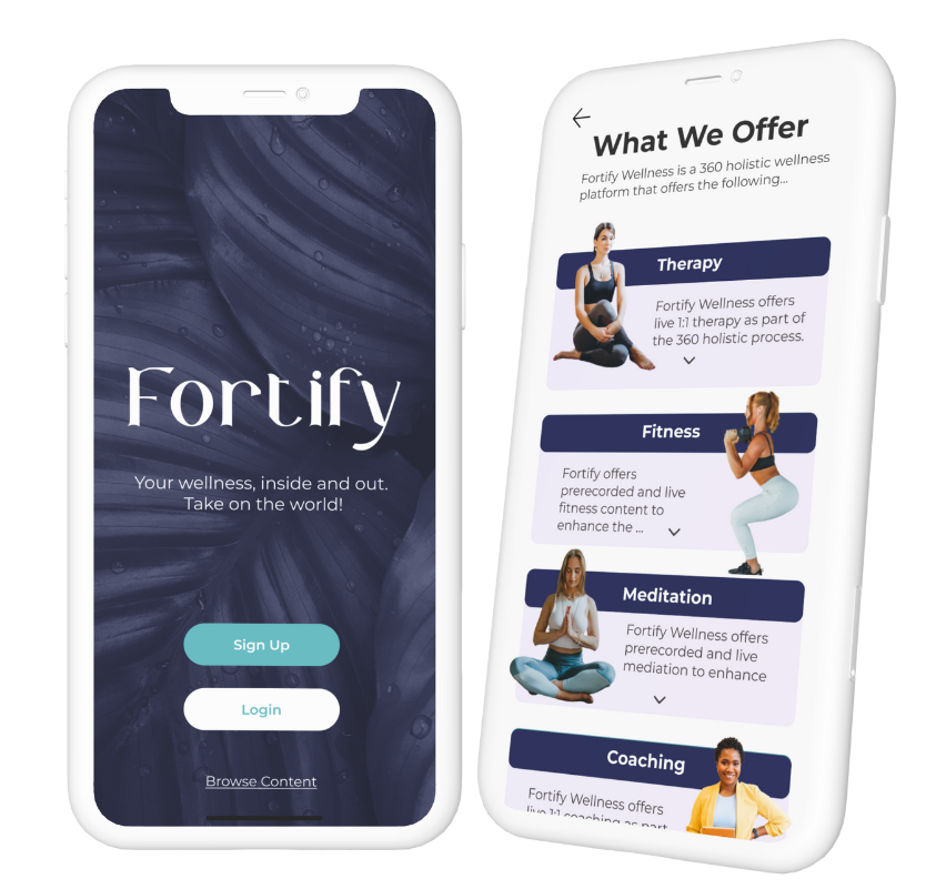
06. Let's build an app that offers therapy, fitness, meditation, and coaching, all under one platform
In shaping our solution, we made a deliberate choice to prioritize the user flow that helps users find a trusted therapist. Our decision was rooted in the understanding that this was a paramount concern for our users and the main feature to create an mvp.
Solution Statement
Fortify Wellness is a holistic wellness platform that consolidates therapy, coaching, fitness, and meditation all in one easy to use app in order to support and manage users’ mental and physical wellbeing.
07. Current state wireframes
Heuristic Evaluation
Our team conducted a thorough heuristic evaluation to assess the current state of the app provided by the client. Our analysis focused on key usability heuristics, including learnability, efficiency, and overall usability. Throughout the evaluation process, we identified numerous violations that needed attention and improvement.


08. Over-extended Olivia's journey
Journey Mapping
Our team synthesized insights from the heuristic evaluation and multiple usability tests to construct a comprehensive journey map. Focused on portraying Over-extended Olivia's experience, the map highlights pain points, frustrations, and emotional responses throughout her interaction with the app. This visual tool serves as a guide for understanding user experiences, enabling iterative improvements that directly enhance Olivia's journey and overall user satisfaction.

08. Validating our assumptions
Usability Testing
Our team conducted a series of usability tests at various versions and fidelities. These tests were instrumental in refining the information architecture and copy of the Fortify app. They provided us with a nuanced understanding of how users interacted with the interface, allowing us to make informed adjustments that ultimately led to an improved and user-friendly final product.
"As a black girl, I immediately feel like this app isn't for me"

"Woah. That got dark, REAL quick..."

"I have no idea what I would be paying for. This is so confusing."

"If none of the questions are about what I want in a therapist, how am I going to be paired with someone who fits my needs?"

09. The final prototype (for now...)
Prototype & MVP
We incorporated the feedback from usability testing to create an improved mockup of our solution. Testing this version showed fewer hesitations and errors compared to previous ones, demonstrating its enhanced usability. We also redesigned the app's aesthetics to exude a confident calmness and feeling of wellness empowerment.

10. Next steps & recommendations
Created within a two-week timeframe, our prototype primarily focused on refining the path for finding a therapist. However, if given more time, our team would aim to flesh out additional user flows, like journaling, fitness, meditation and scheduling sessions.
We would also recommend:
1. Daily affirmations & wellness challenges - Users strive to stay consistent with their wellness journeys & appreciated features such as daily meditation challenges/ affirmations.
2. Personalization - Content on the app can be personalized for each user based on content/ videos they've favorited and features they frequently use.
3. Accessibility - We must make sure that our app is accessible for all types of users. and complies to the Web Content Accessibility Guidelines. (This includes CC options for videos, Alt Text, and finding therapists who can communicate with all users.)
4. Dark Mode - A Dark Mode option as a distraction-free environment that's easy on the eyes.
11. Reflection & retrospective
The valuable lessons learned below have significantly shaped my approach to design:
1. Navigating Sensitive Topics: Conducting user interviews on mental health highlighted the importance of navigating sensitive subjects with empathy and respect. Learning to create a safe space for users allowed for more authentic insights and meaningful design solutions.
2. Diverse Perspectives: Recognizing that others may see aspects I don't due to their unique experiences became really valuable. Embracing diverse perspectives within the team enriched the design process, uncovering blind spots and creating a more inclusive final product.
3. Organized Structure in Team Collaboration: Working in Figma as a team underscored the need for a well-organized structure. Establishing guidelines and a framework is important to ensure everyone is on the same page, facilitating smoother communication and collaborative design efforts.