04. Current state website
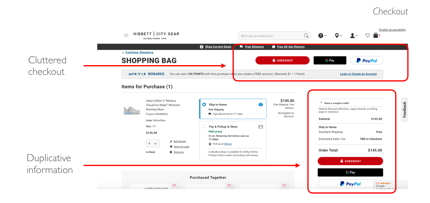
Heuristic Evaluation
I conducted a thorough heuristic evaluation to assess the current state of Hibbet | City Gear's website. My analysis focused on key usability heuristics, including learnability, efficiency, and overall usability. Throughout the evaluation process, I identified numerous violations that needed attention and improvement.


05. Athletic Amber's journey
Journey Mapping
I synthesized insights from the heuristic evaluation and multiple usability tests to construct a comprehensive journey map. Focused on portraying Athletic Amber's experience, the map highlights pain points, frustrations, and emotional responses throughout her interaction with the website. This visual tool serves as a guide for understanding user experiences, enabling iterative improvements that directly enhance Amber's journey and overall user satisfaction.

06. Finding inspiration on how to create intuitive navigation, provide accessible reviews, & simplify the checkout experience
Competitive & Comparative Analysis
I conducted an in-depth competitive analysis within the athletic gear industry, examining industry leaders such as Nike, Adidas, and Finish Line and comparator's like Asos and Allbirds. The objective was to identify their distinctive features and understand their primary objectives, serving as a source of inspiration to inform my project's direction.
- How do Asos & Nike create easy and Intuitive primary navigation?
- How does Nike provide accessible reviews & ratings sections?
- How does Allbirds simplify their checkout experience?

07. How can we solve the problem?
Early Sketches & Low-Fi Wireframing
In the solution ideation phase, I used the insights from my user research as a foundation. I initiated the process with sketching and wireframing, a quick and cost-effective method that facilitated brainstorming and feature prioritization. This approach allowed me to identify the most valuable features for users, including Amber, before diving into higher-fidelity wireframing.

08. Let's create a website that provides athletic gear shoppers an easy and intuitive shopping experience
Solution Statement
Hibbett Sports City gear provides a convenient/ intuitive browsing and navigation experience for users to purchase athletic gear, quickly find trusted recommendations, and access accurate sizing information through collapsable and prominently located features, so users can find comfortable, good quality items, that fit well.
09. Validating our assumptions & making iterations
Usability Testing
I conducted a series of usability tests at various fidelities. These tests were instrumental in refining the information architecture and copy of our app. They provided me with a nuanced understanding of how users interacted with the interface, allowing me to make informed adjustments that ultimately led to an improved and user-friendly final product.
"I didn't see the menu bar there because I thought it was part of the logo"

"I'm not sure what any of these icons would be bringing me to"

"This is overwhelming and I have no idea where I would find cleats"

Card Sorting
I decided to do a card sort with 5 users to understand how different people understand and categorize the information in Hibbet's navigation. This helped create an information architecture that matches my user's expectations.


"That took a lot of scrolling and time to find reviews and ratings"

"This does not make it easy to understand what I'm buying. Why is there so much text on this page?"

10. Validating our assumptions & making iterations
Prototype & MVP
I incorporated the feedback from usability testing to create an improved mockup of the solution. Testing this version showed fewer hesitations and errors compared to previous ones, demonstrating its enhanced usability.

In The Future
Created within a two-week timeframe, I primarily focused on refining the primary and secondary navigation as well as decluttering the overall experience, if given more time, I would aim to expand and enhance the app's functionality by testing different iconography, button placement, and greater personalization.
11. Reflection & retrospective
This project served as my first real concept project. The valuable lessons learned below have significantly shaped my approach to design, emphasizing the importance of adaptability, collaboration, and continuous improvement:
1. Openness to Iteration: Embracing the concept of not marrying my ideas was crucial. Learning to detach from personal attachments to designs allowed for more objective evaluation and improvement.
2. Constructive Criticism is Invaluable: Understanding that design critiques are not personal critiques was a pivotal realization. Constructive feedback, even if it challenges my ideas, is an essential component of the design process.
3. Continuous Testing: The importance of continuous testing was a fundamental lesson. Recognizing that testing is not a one-time event but an ongoing process allowed for more responsive adjustments and improvements.
4. Collaboration: Acknowledging that user's perspectives are as important as (if not, MORE important than) my own was an important mindset. Diverse insights contribute to more well-rounded and inclusive design solutions.


